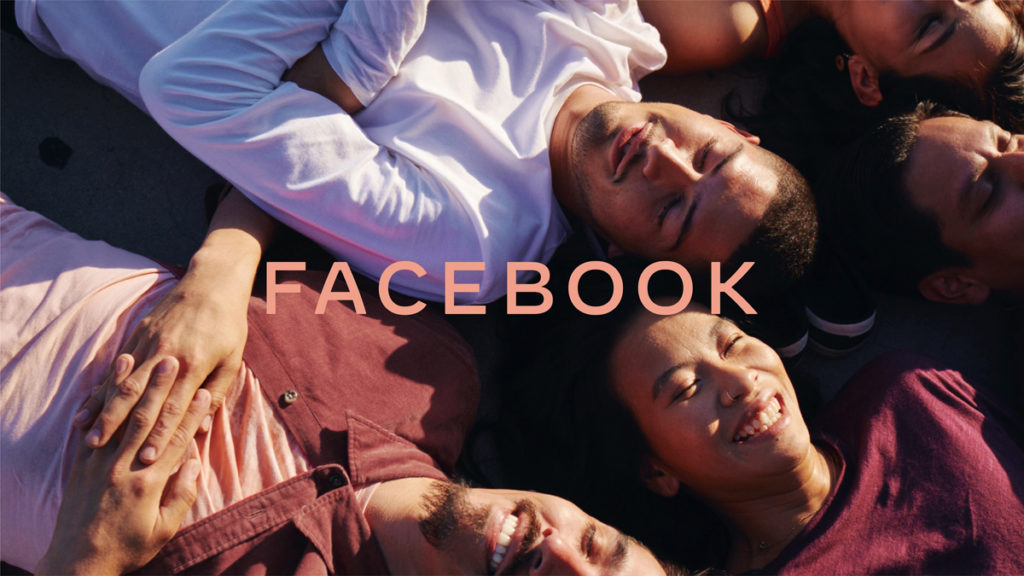
Facebook has refreshed its brand identity with a new logo that looks nothing like the original. While the original graphic is here to stay (it’ll still be used for the Facebook app), the company is adopting one with custom typography and capitalization for clarity. It’ll be used to better communicate what apps and services the social media giant owns.
We started being clearer about the products and services that are part of Facebook years ago, adding a company endorsement to products like Oculus, Workplace and Portal. And in June we began including “from Facebook” within all our apps. Over the coming weeks, we will start using the new brand within our products and marketing materials, including a new company website.