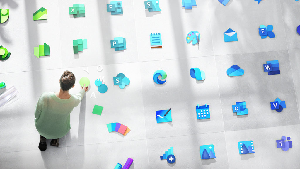
One of Windows 10’s recurring problems relates to its presentation, as users have long complained about the lack of design consistency between classic (Win32) programs and modern apps. Improvements appear to be coming on the icon front, however: Microsoft’s head of Office design has published an early peek at the new icons coming to the Windows ecosystem and related applications. There are over 100 of these, all of which were crafted under the company’s “Fluent Design System” for eye-catching depth and color.
We conducted countless rounds of research for every icon. From mild to wild, we explored a multitude of design directions and listened to customers around the world. We learned what didn’t resonate with people (flat design and muted colors) and what did (depth, gradations, vibrant colors, and motion), all of which drove our decisions.


