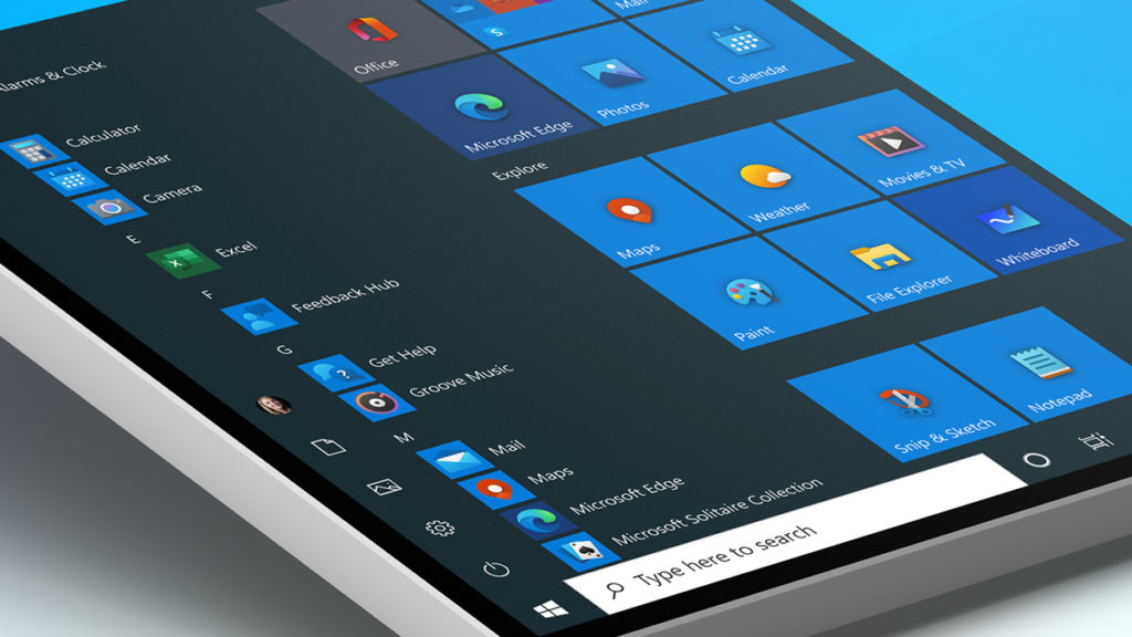
Windows 10 isn’t the worst-looking operating system out there, but certain aspects of its user interface are in dire need of an overhaul. These would include archaic icons, many of which date back decades and have become major eye sores – but changes are finally afoot.
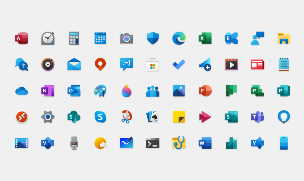
Microsoft has begun rolling out the first of its Fluent Design icons to Windows Insiders in the Fast ring, adding a colorful element to built-in apps such as Alarms & Clock, Calculator, Mail, and Calendar. Many of them seem inspired by Android’s Material Design language, but they’re a definite upgrade from the “flat, monochrome” icons that were previously employed.

The Fluent Design System introduces “depth and color to our iconography,” explained Microsoft. “These additional cues are subtle, but they make a world of difference when scanning an interface. We live among multiple operating systems, constantly switching between tasks, priorities, and identities. The addition of color also gives a cohesive design language across platforms: the icon that’s familiar in Windows 10 is the same on Android, iOS, and Mac, providing a wayfinding path across your digital life.”
Windows Insiders in the Release Preview and Fast rings can enjoy these visual upgrades immediately, but the new icons won’t roll out to other users until the next major update. That would be Windows 10 20H1, which is set for release in Spring.
