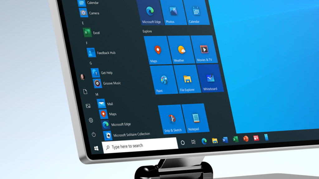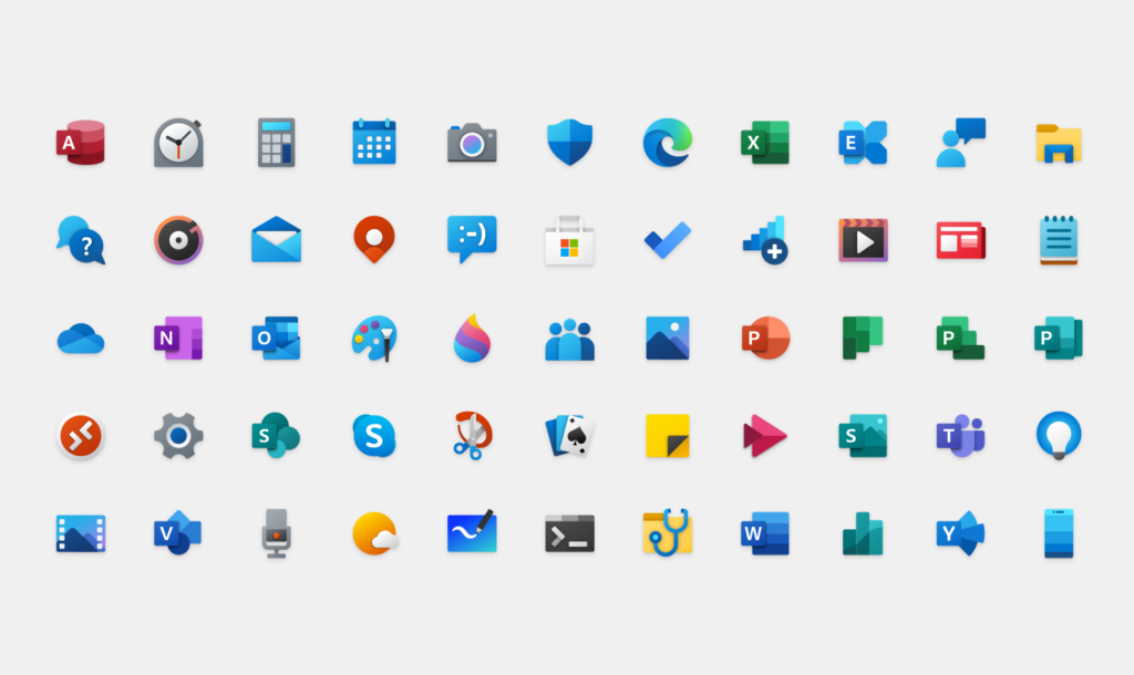
Microsoft’s design team has shared an early peek at what Windows 10’s Start Menu will look like in the near future, and it looks like a definite improvement over the current version. Gone are the monochrome tiles and tedious icons, which have been replaced by modern, colorful versions with a better sense of depth. The background color of the tiles have also been changed to line up with the user’s chosen scheme of light or dark.
Created by the @Windows design team, this animated clip illustrates a sliver of the #UX evolution and modernization of the Windows experience. Let us know what you think in the comments below! pic.twitter.com/s4SVXncLEo
— Microsoft Design (@MicrosoftDesign) April 6, 2020
It isn’t clear when the new Start Menu will debut, but Windows 10 users should already be seeing some of Microsoft’s new icons, which were developed under the company’s Fluent Design language. “Leveraging the Fluent Design System, we introduced depth and color to our iconography,” wrote Microsoft in a blog entry explaining its approach.

“These additional cues are subtle, but they make a world of difference when scanning an interface. We live among multiple operating systems, constantly switching between tasks, priorities, and identities. The addition of color also gives a cohesive design language across platforms: the icon that’s familiar in Windows 10 is the same on Android, iOS, and Mac, providing a wayfinding path across your digital life. The new rounded corners across the Windows 10 interface achieve the same goal: making these icons feel like they live in the real world; something familiar and approachable to grab onto.”
